Quora Dark Mode
Quora Dark Mode
Adding themeability to a massive consumer platform

Summary
I helped design and implement dark mode on the Quora platform, both on mobile and desktop.
Background
As Quora matured as a product the lack of a universal dark mode become more problematic. Nearly every other comparable social product had the option to enable a dark variant, which hurt Quora's image as a modern consumer product. While migrating the platform to React, we took the opportunity to implement a robust dark mode color theme on the product.
Goals
- Design a dark color theme which adheres to Quora's existing brand language.
- Implement a dark mode experience while maintaining key engagement metrics.
- Apply the same color theme and implementation mechanisms across both mobile and desktop.


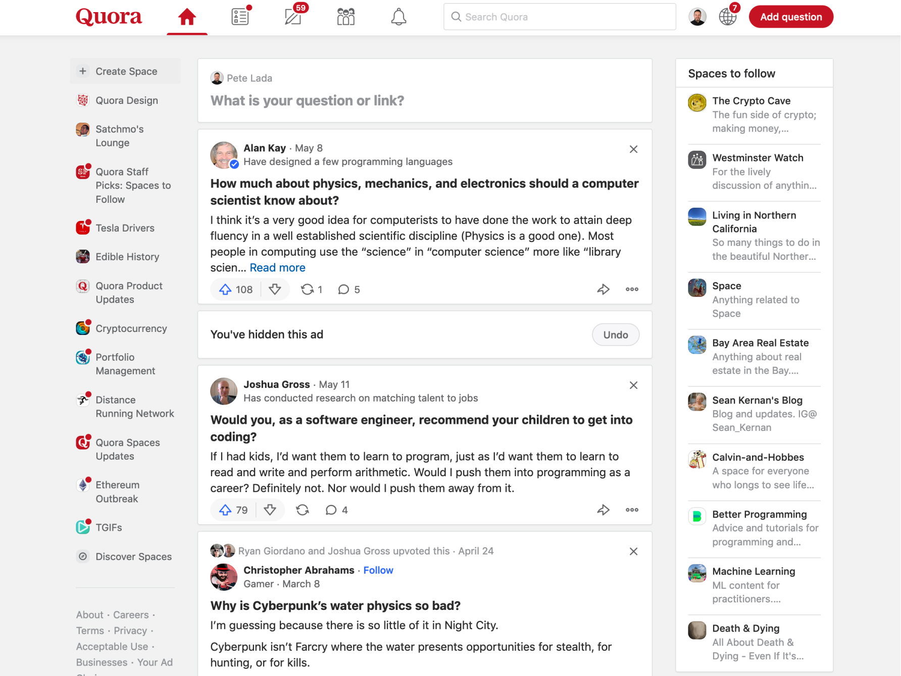
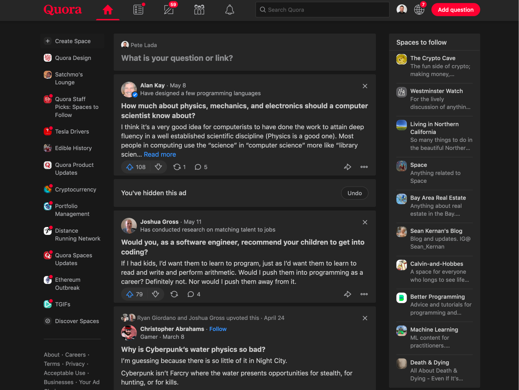
Quora's home page in both light and dark mode (use slider to reveal entire view).


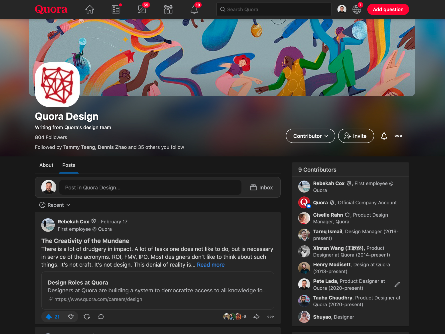
An example Space on Quora in both light and dark mode (use slider to reveal entire view).

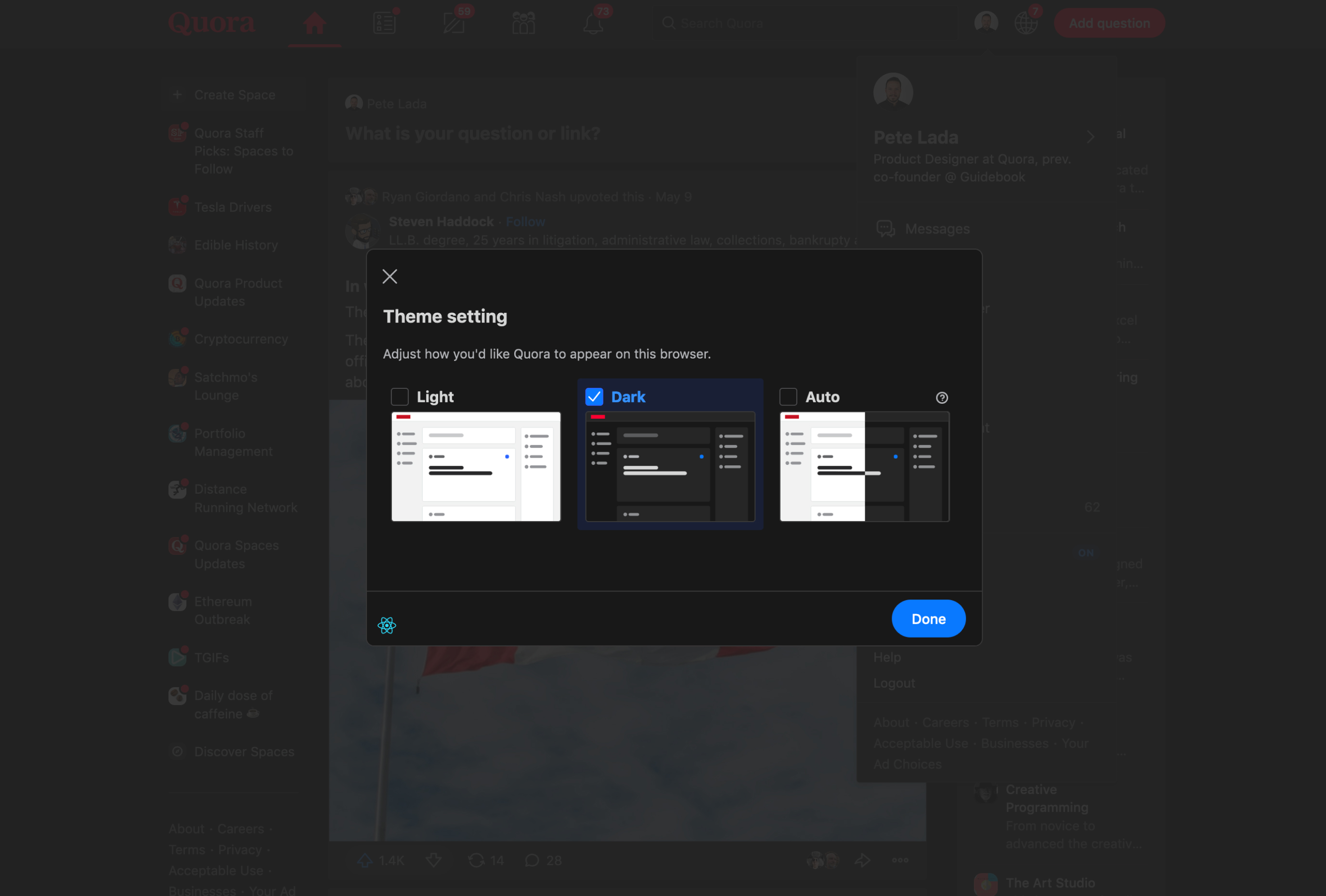
The theme setting switcher uses abstracted images to give a hint of each theme.

The theme setting switcher uses abstracted images to give a hint of each theme.
Specific challenges
Shallow theming infrastructure
While our initial React implementation had light theming capabilities, there didn't exist the ability to support more than two themes (necessary for experimentation) or robust theme contexts. I wrote much of the front end code which powered these new concepts, allowing us to test multiple theme variants against eachother.
Negative engagement investigation
Our initial dark theme showed an ~3% engagement drop with users in the experiment. I led an effort to understand this drop, including testing a number of different dark theme variants. We discovered that the drop was caused by enabling the "auto" theme mode by default, causing us to adjust the default theme setting and successfully launching the experience.

I experimented with a number of theme variants and tested them in production. No variant proved to be more successful than another.
Legacy views
While most of the product was migrated to React at this point, there were a number of views which used Quora's legacy front end framework which had no support for (or awareness of) theming. I had to duplicate much of our existing theme logic and infrastructure to support these legacy views as to not break the dark mode experience.
